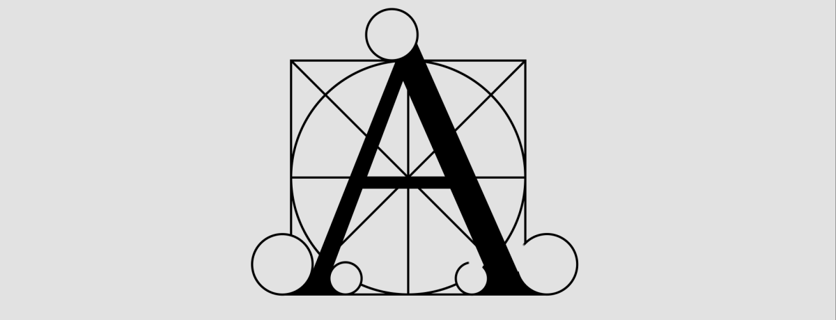
Antiqua - a class of typographic typesetting fonts
Antiqua (lat. antiqua "ancient") is a class of typographic typefaces with serifs that appeared during the Renaissance in Western Europe. The basis for the developers of the first humanistic or Renaissance antiquas was a handwritten book handwriting - the humanistic minuscule.
According to one of the historical versions, the first antiqua was carved by the engraver Nicolas Jeanson in Venice in 1470. However, similar fonts have been created before. In particular, in the mid-1460s, not far from Rome, in the monastery of Suabiko, the typographers Sveinheim and Pannarz created their own version of the humanistic type. Be that as it may, the first generation of antiqua fonts is considered to be the Renaissance Venetian antiqua. Later, French, Dutch and English versions of this font appeared. The Renaissance, or humanistic antiqua, was distinguished by a certain lapidarity. The transitional serif that replaced it was more refined. At the end of the 18th century, French and Italian printers, the most famous of which were Bodoni and Didot, developed a new, more rigorous and balanced style - a new (classic) antiqua.
Antiqua old style
According to their external features and time of creation, Renaissance antiquas belong to two groups: Venetian and Italian-French.
The Venetian serif appeared earlier, it is closest to the prototype - writing with a wide-nib pen. The contrast between the main and auxiliary strokes is small, the axes of the oval elements are inclined, the serifs are asymmetrical, the drop-shaped elements have the shape of a trace from a rectangular pen, the jumper in the letter e is slanted.
Modern fonts based on the Venetian antiqua by Nicolas Jeanson and Francesco Griffo - Adobe Jenson, Nicolaus, Centaur.
Italian-French antiqua - later, XVI century; by this time, the production of type had reached greater perfection, which made it possible to increase the contrast between strokes. The jumper in the letter e became horizontal, the serifs became thinner and more regular, the drops became more rounded.
Today it is represented by the fonts Garamon, Palatino, Bembo, Caslon and others based on the works of Claude Garamon, Ald Manutius and other authors.
Transitional serif
The transition from the old antiqua began at the end of the 17th century. It is traditionally believed that the new font design was first created for the needs of King Louis XIV of France. The work was based not on a handwritten drawing, but on geometric constructions and "natural proportions".
In the 18th century, the Baskerville typeface was created (named for its creator, John Baskerville).
Transitional serifs are distinguished by stronger contrast, vertical axes of oval letters, rounded symmetrical serifs, semi-closed shape of characters. The shape of the symbols was influenced by the invention of the pointed pen in the 17th century.
The number of transitional antiquas is small, but they have the widest application.
New antiqua
The most correct and geometric among the different styles of antiqua. It is characterized by high contrast, vertical axes of oval elements, closed forms of signs, rounded drop-shaped elements. In readability, it is inferior to Old Style and transitional antiquas.
Abroad, it was the main font for typing from the end of the 18th to the beginning of the 20th century; in the USSR continued to be widely used until the end of the 80s, especially for scientific and technical literature.
Examples of new serif fonts are Bodoni, Didot, Ordinary New, Computer Modern.
Relationship between font pattern and paper properties
Renaissance and Baroque metal type types (old-style and transitional serifs) were designed to be printed on the matte paper available at the time. The new serif was used for printing on glossy paper. To maintain a coherent impression of the publication, you should take this into account when using fonts for printing on paper that suits them.
Relationship of font designs with national languages
In his famous work Typography, the Swiss typographer and graphic designer Emil Ruder points out that typefaces can be linked to the language of their creators: “Garamon is linked to French, Coezlon to English, and Bodoni to Italian. Any of these three fonts used in a set in another language can suffer significant aesthetic damage. For example, the Bodoni used in the German set is not the same font; the picture of a foreign text full of capital letters is contraindicated for him.”
The influence of calligraphy on the shape of characters
Writing with a pen (broad and sharp) influenced the shape of the letters in typefaces.
When writing with a wide-nib pen, the thickness of the line depends on the direction of the pen movement: whether the pen moves up, down or to the side, which is clearly seen in the letters M and N. The pen is held at an angle when writing, so the letter O in the old antiqua is asymmetric.
When writing with a pointed pen, invented in the 17th century, the thickness of the stroke depends on the force of pressure on the pen, and not on the direction of its movement. This, along with progress in working with metal, influenced the shape of the letters: they became more contrasting and symmetrical.
Source: ru.wikipedia.org
* All the materials presented on the site solely for acquaintance with nonprofit purposes.


