- Blog
- Features of Gothic writing

Features of Gothic writing
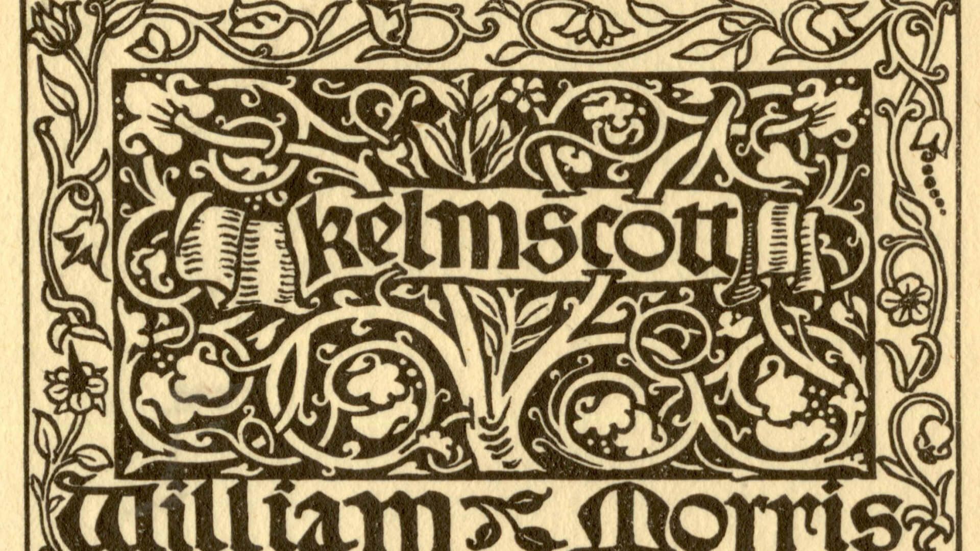
Gothic writing is a family of handwritings of Latin writing of the Middle Ages. It arose in the 11th century, replacing the Carolingian uncial script.
From the beginning of typography, type-setting Gothic fonts appeared - the famous Gutenberg Bible was typed in a variant of the texture. In Italy, the first printed books with Gothic type appeared in 1473 (these were the works of J. de Torquemada and R. Caraccioli).
The name itself (from the “barbarian” people of the Goths, who actually had nothing to do with this typeface) was proposed in the 15th century by figures of the Italian revival, who considered such typefaces “barbaric” and contrasted them with ancient Roman writing.In the Romanesque and Eastern European Western Christian countries, the antiqua was adopted immediately, however, among the Germanic peoples (as well as among the peoples under the cultural dominance of the latter - Finns, Estonians, Latvians, etc.), for the same reasons, fractura (a kind of Gothic writing) began to be used ), while the fraction was clearly opposed to antiqua as a different writing system and was never used to write in languages where the Gothic script was not accepted (for example, German-Latin, German-French or German-Czech texts (dictionaries, bilinguals or glosses) were written fraction for German and antiqua for Latin, French or Czech). Subsequently, the rejection of fractionation was partly associated with bourgeois revolutions - the Dutch abandoned fractionation during the Dutch Revolution, the British and Scots during the English Revolution, the Swedes during the “era of freedoms” in the middle of the 18th century, in Norway and Denmark, fractionation until the end of the 19th century , in Germany until the middle of the 20th century, although the antiqua was actively used from the end of the 19th century. From the 16th century, Gothic writing was gradually replaced by antiqua-based fonts close to modern ones; the longest (until 1918 and partly until 1945) the Gothic type was preserved in Germany and Latvia (the Latvian language was officially transferred from Gothic to Antiqua in 1926, and German editions in Latvia and Estonia continued to be printed in Gothic even after that). Gothic fonts were widely used in Germany until the beginning of the 20th century, but were banned during the Third Reich in 1941. Nowadays, fonts based on the Gothic style are used for decorative purposes, as well as for some mathematical notations.
The general appearance of Gothic symbols is determined by the use of goose feathers cut diagonally as writing instruments. The writing edge is in most cases at a 45° angle to the base line of the line. The letters are very tightly packed, and the width of the inter-line spaces is close to the width of the strokes - this is due to the need to save expensive parchment (hence the English name for the Gothic letter - Blackletter). Ligatures and abbreviations are widely used.
The main varieties of Gothic writing:
- Texture (German Textur, Latin Textualis) - sharp writing;
- Fraktura (German Fraktur) - a sharp letter with broken outlines;
- Schwabacher (German: Schwabacher), or bastard - a broken letter with rounded outlines of some letters;
- Rotunda or Round Gothic (Italian Rotunda, German Rundgotisch) is a transitional form of writing from Gothic to antiqua.
- Current (Gothic italics). From the beginning of the 20th century Sütterlin is adopted as standard Gothic italic.
Source: ru.wikipedia.org
* All the materials presented on the site solely for acquaintance with nonprofit purposes.
Powered by SEOexpert.by.


